BQool / Enterprise SaaS / AI insights
Turning Campaign Chaos into Confident Decisions.
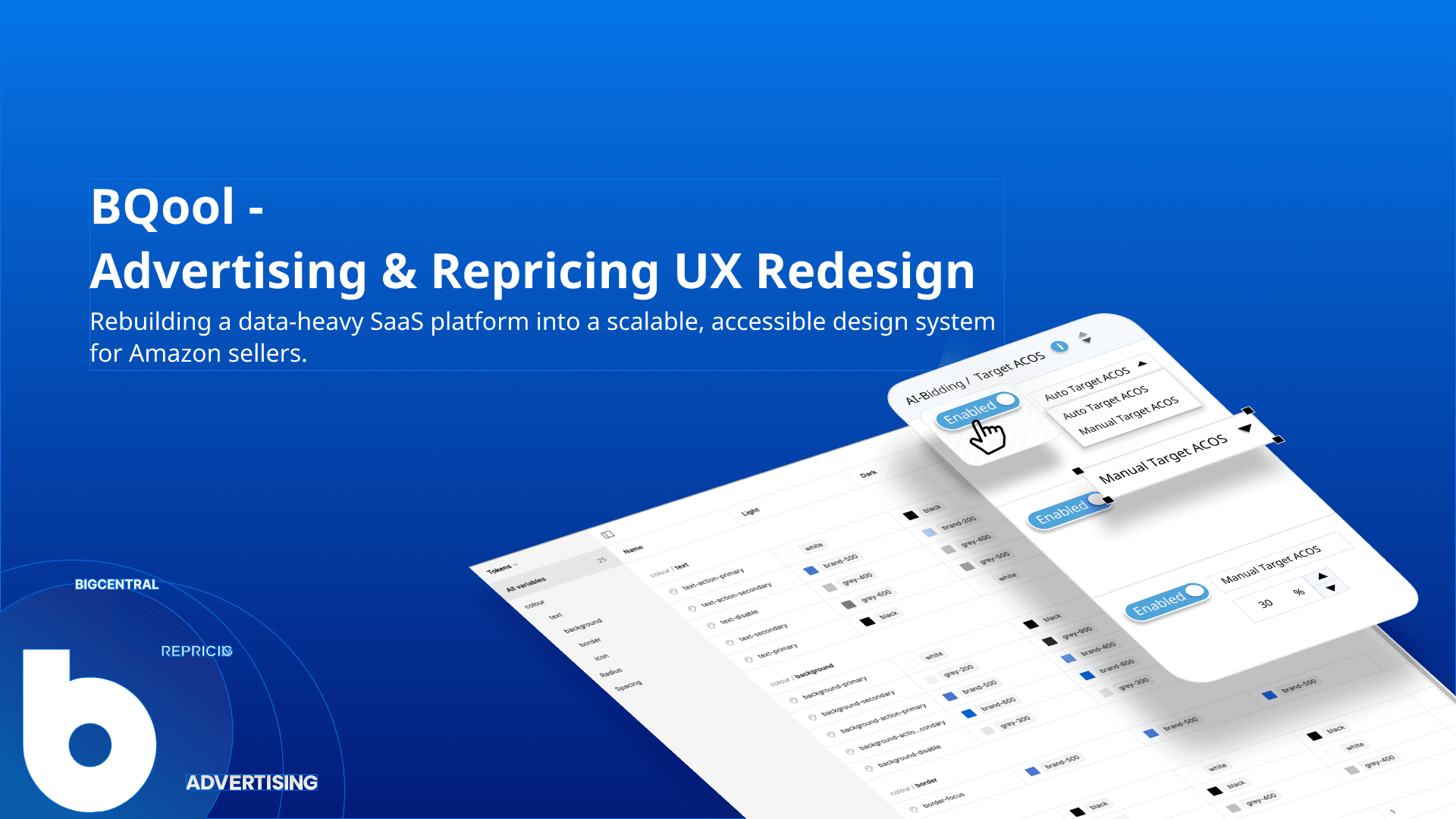
Led the system-level redesign of BQool's advertising and automation platform — replacing a fragmented legacy UI with a shared, token-based library and structuring AI recommendations sellers can act on with confidence.
Role
Senior Product Designer & Design System Lead
Period
2025 - Present
Engagement
Full-time
Industry
Advertising technology
Complexity
Simplified workflow-heavy advertising and repricing tools
System
Rebuilt a fragmented UI library into a scalable design system
Decisions
Turned dense metrics into clearer signals, diagnosis, and action
Fragmented UI
Shared product language
Metrics without direction
Signal → diagnosis → action
AI as answer
Evidence + review
Independent components
Governed system
Static handoff
Versioned design-to-code workflow
A System,
not a Screen.
Challenge
BQool had grown into a powerful advertising and automation platform, but a decade of ad-hoc Bootstrap patterns left no shared design language behind it.
- Fragmented UI — tables, filters, forms, and automation settings had each evolved independently.
- Trust Gap — high-volume campaign work was hard to scan and act on with confidence.
- Distributed Team — PMs, engineers, analysts, and customer-facing staff spanning the US and Asia.
Design strategy
I focused the redesign on decision quality, replacing legacy Bootstrap patterns with a shareable, token-aligned component library.
- Library-first — tables, filters, forms, and modals draw from one token-driven source.
- Hierarchy & Disclosure — hierarchy surfaces what needs attention; disclosure controls density.
- Guided Automation — contextual guidance and validation build trust into automation settings.
- Explainable AI — BQool Insight structures findings with evidence and a next step.
Insight without a research team.
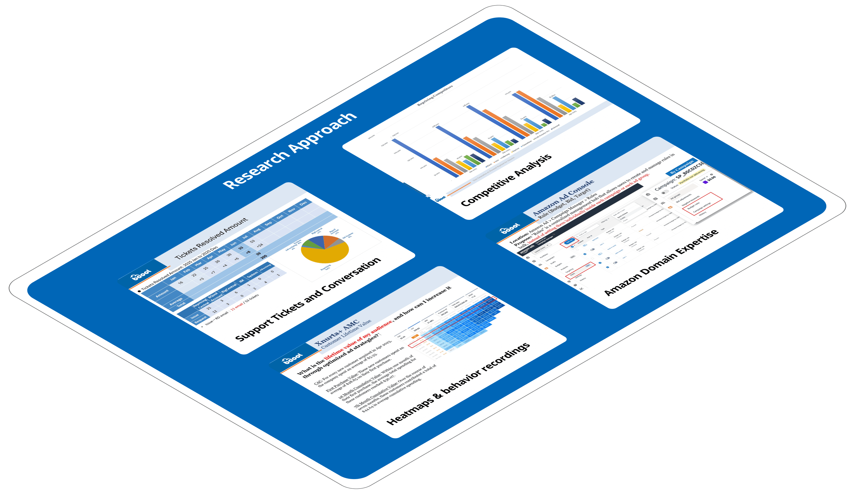
BQool had no dedicated research function, so insight came from the people closest to the problem — synthesized into findings, not left as scattered anecdotes.
Repeated signals were treated as evidence; isolated anecdotes were not.
Optional depth — all 12 discovery sources & insights
Discovery sources
- Customer Success — Direct seller pain points surfaced from support conversations.
- Business Analysis — Amazon advertising domain expertise — match types, policy constraints, campaign structures.
- Marketing — Launch messaging and competitive positioning, surfacing what needed to read clearly at a glance.
- Project Management — Historical and technical context on why past patterns existed.
- Product Management — Roadmap priorities and product requirements.
- QA — Logic validation and behavior patterns against real edge cases.
Key insights
- Data overload — Sellers were overwhelmed by dense tables, metrics, and filters.
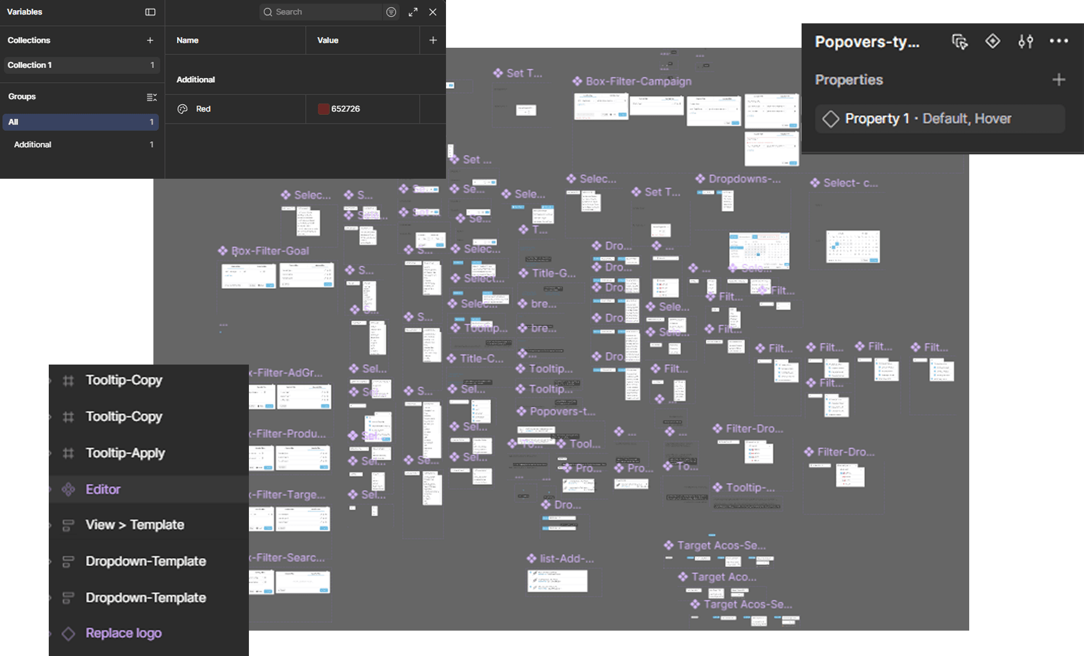
- Inconsistent patterns — Components were rebuilt page by page without a shared atomic structure, so the same interaction behaved differently depending on where a seller ran into it.
- Policy-driven UX — Frequent Amazon policy changes forced flows to adapt on short notice.
- AI underutilized — Sellers didn’t understand how to use the AI features at all.
- Learning curves — Sellers preferred stable, familiar UI over novel patterns.
- Token & file drift — Naming, layer structure, and component properties had all drifted from Bootstrap 5 conventions, with static variants standing in for Figma’s interactive properties.
BQOOL DECISION SYSTEM
From metrics to action.
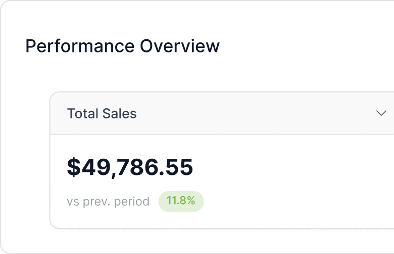
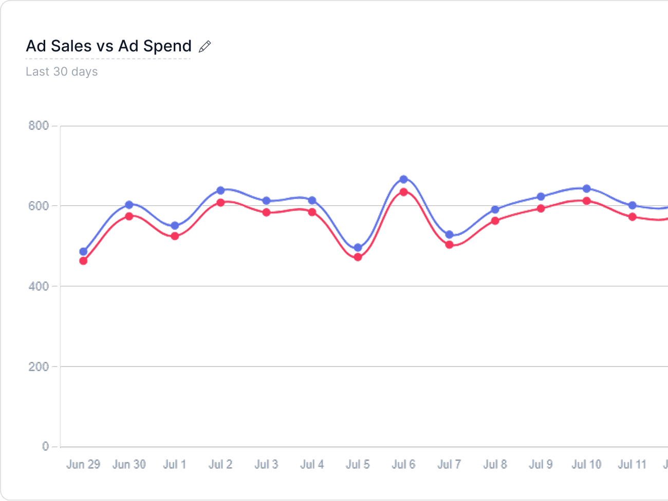
The dashboard is designed as a decision path: establish performance, inspect the highest-impact exception, then choose an informed action.
Signals
Campaign performance
Sales, spend, ACoS, orders, trends
Diagnosis
Prioritized finding
Impact, evidence, and explanation
Decision
Recommended action
Review, adjust, approve, or dismiss
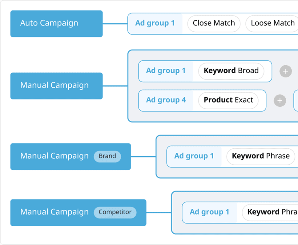
Density and hierarchy, deliberately.
Every table is a set of visualization decisions before it’s a set of rows — what sorts first, what stays visible, and what a color alone is never allowed to say.
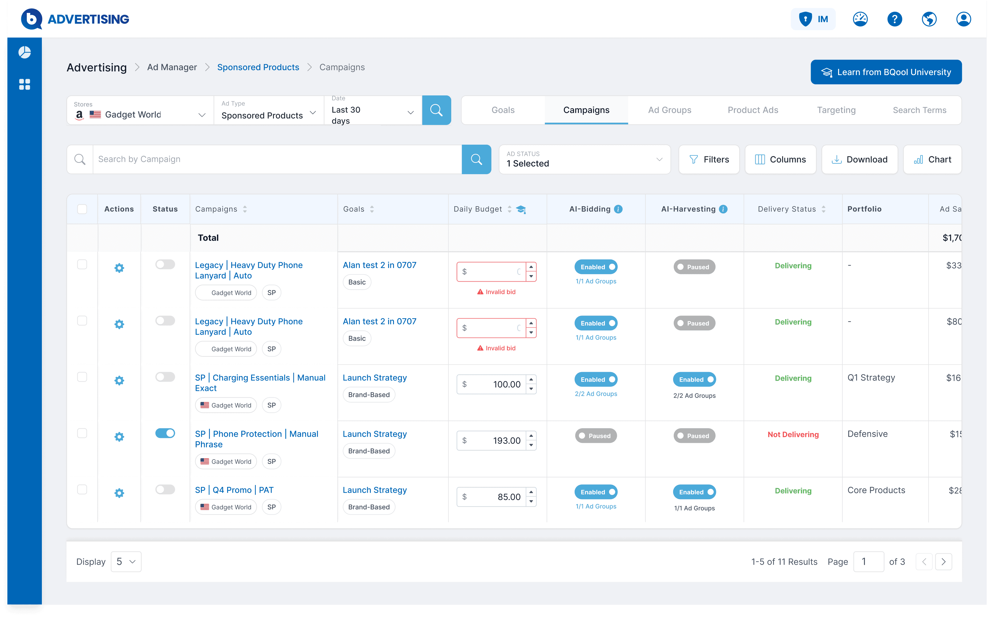
Status visibility
Inline budget validation
Scoped AI controls
AI recommendations stay proposals until the seller approves them.
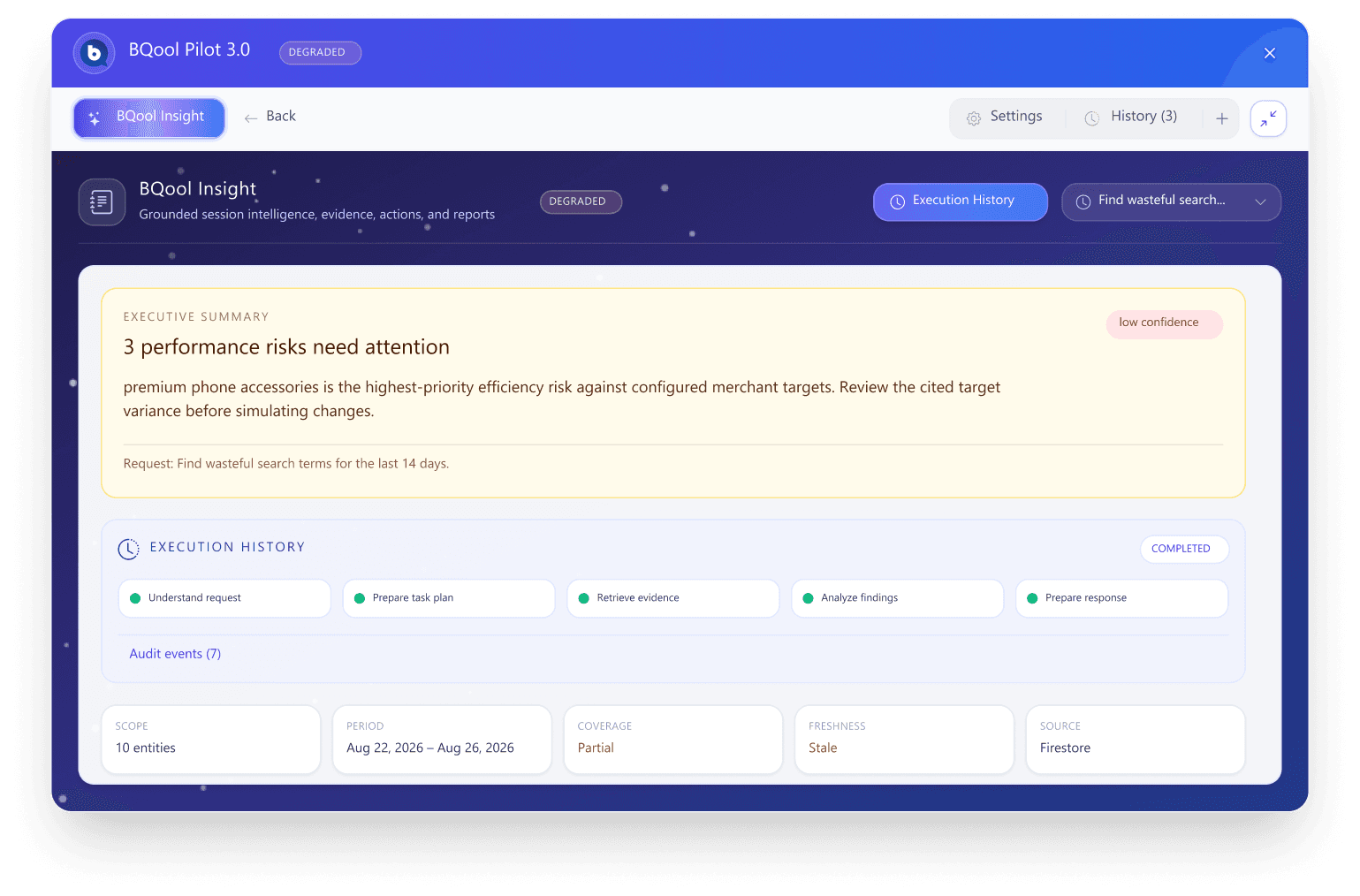
Research showed sellers didn’t understand how to use BQool’s AI features at all. BQool Pilot routes a request to the right skill — campaign audits, period comparisons, search-term waste — and BQool Insight is the structured report that comes back: an auditable execution history, a confidence rating, and a mode badge when data is incomplete or stale, instead of masking it. Findings stay ranked by severity with the source agent attached.
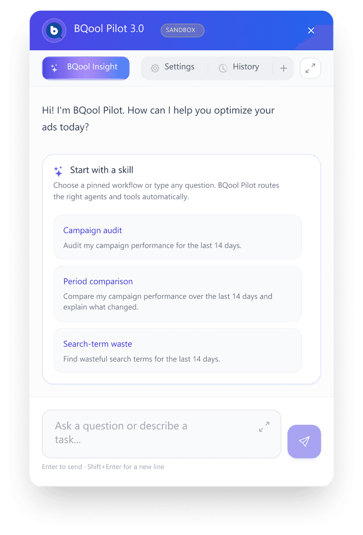
Critical automation stays inspectable before it becomes irreversible.
Trust is designed at two levels: guardrails inside the interaction itself, and guardrails built into the shared component library so every new screen inherits them.
Interaction guardrails
Rule-based automation controls live ad spend, so these guardrails are load-bearing, not decorative:
- 01Contextual guidance
Inline explanation of what a rule will actually do before it’s configured.
- 02Validation before save
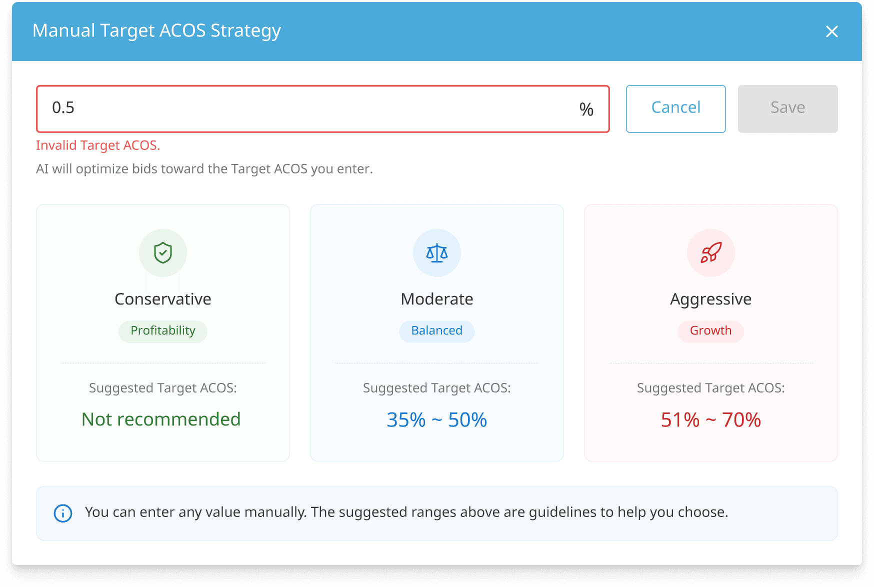
A rule can’t be saved until its value passes validation — the Save action stays disabled until the input is valid.
- 03Guardrail before unattended action
A confirmation step gates anything that acts on live spend without a human in the loop.
System guardrails
Verified automatically, not assumed.
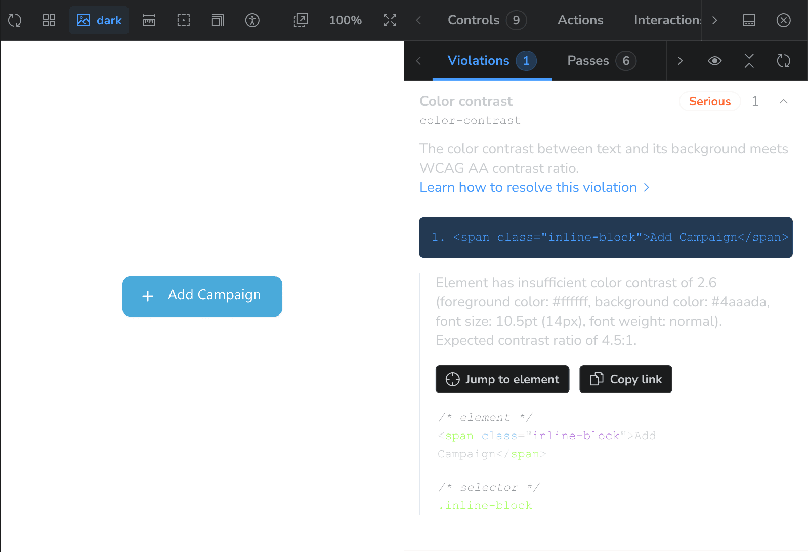
Every component runs through Storybook’s accessibility addon (axe-core) — contrast, ARIA, and focus checks execute automatically. Real catch: a button’s text contrast measured 2.6 against a required 4.5:1, flagged before it shipped.
One seller, three products, one language.
Repricing Manager, BigCentral, and Advertising serve the same seller, often in the same session. Before the shared library, each had drifted into its own visual language — different tables, different filters, different ways of saying the same thing.
Before
Repricing
Own visual language
BigCentral
Own visual language
Advertising
Own visual language
After
A seller moves between all three without noticing the seams

One source of truth, versioned like code.
The response to the audit was a token-driven library that consolidated 50+ redundant components into one governed source — serving Repricing, BigCentral, and Advertising instead of three divergent UIs.
Consolidation at scale
50+ → 1
redundant components consolidated into one governed library, documented and browsable in Storybook.
How consistency survives implementation.
One design token, one governed source, multiple implementation targets.
A governed system only holds if it survives handoff. Every token moves through the same reviewable pipeline, from Figma to shipped product.
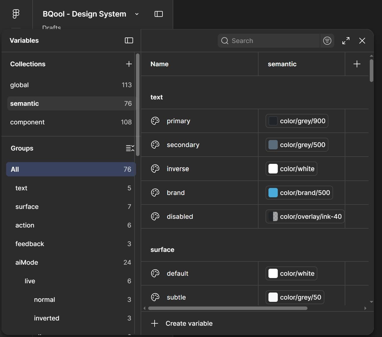
Global, semantic, and component layers — structured as Figma Variables, not one flat list.
Token Studio exports the token set as JSON; AI coding agents (Claude Code, Codex) help translate it to and from code via MCP, synced through the GitHub API.
Engineers review a real PR diff — reviewable, commentable, revertible.
Merged JSON drives Bootstrap today — the same pipeline maps to Tailwind or React Native.
Optional depth — see the token in code
One token, three outputs
The same brand-500 token, structured once in Figma Variables, consumed however the stack needs it:
Bootstrap (shipped)
$brand-500: #0873bd;
Tailwind config
500: 'var(--color-brand-500)'
React Native theme
export const colorBrand500 = "#0873bd";
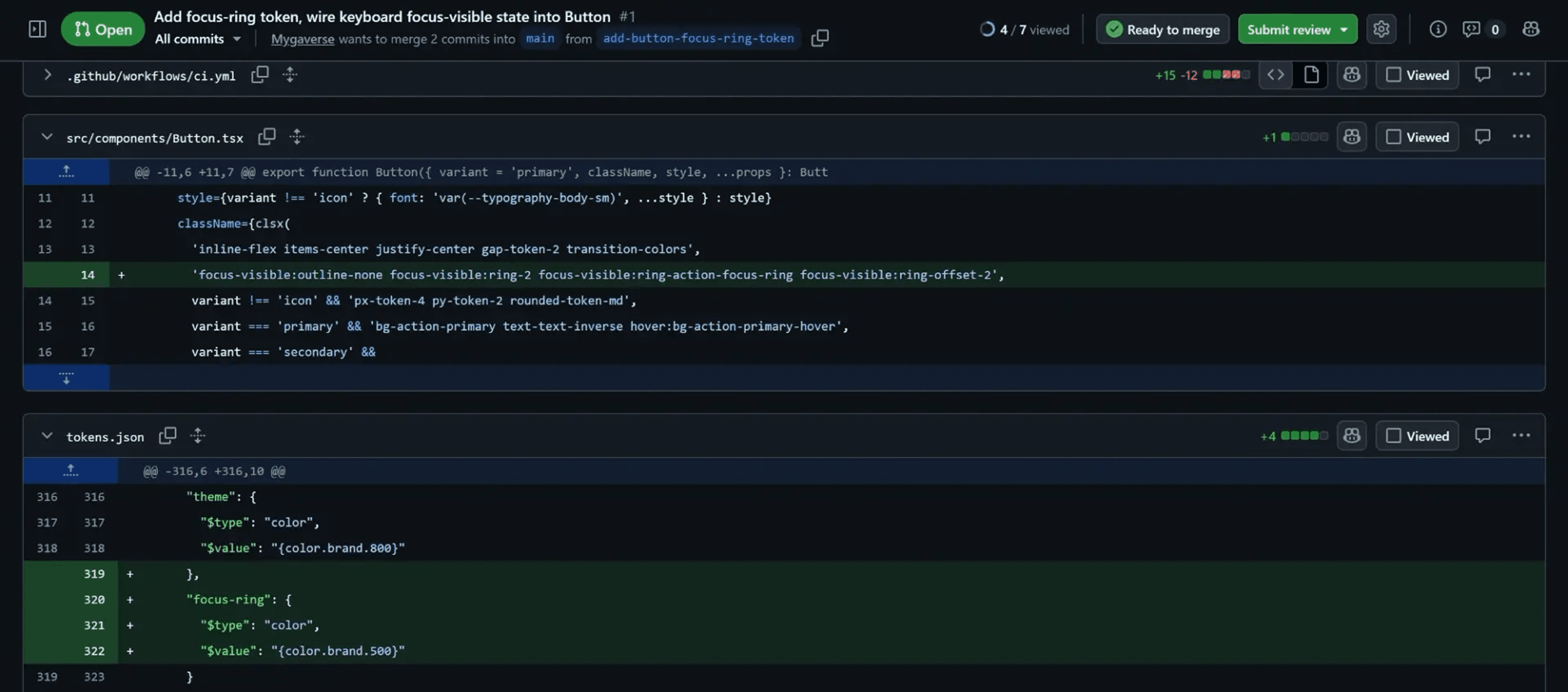
Real PR diff
A token sync reviewed like any other code change — this PR adds a missing keyboard focus-ring token and wires it into a real component.
Design that shipped, not just shipped design.
Leading the migration meant aligning more than pixels — coordinating scope with PM, specs with BA, and Bootstrap 5.3 handoff with engineering, while bringing junior designers into the new system.
Collaboration
Coordinated scope and roadmap with PM, feature specs with BA, and launch visuals with marketing — so the migration moved as one system, not five separate handoffs.
Mentorship
Mentored junior designers into the new atomic component patterns, turning the migration into a shared design language instead of a solo rebuild.
Technical handoff
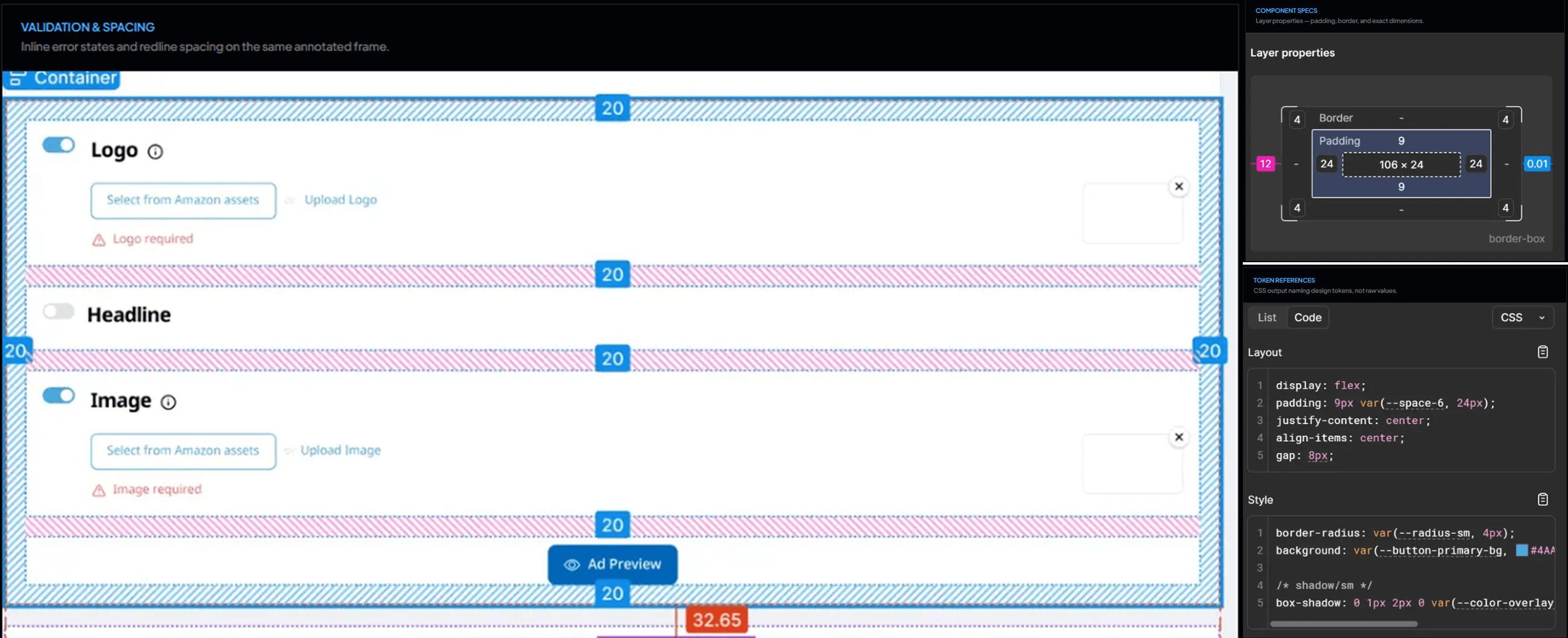
Partnered directly with engineering on Bootstrap 5.3 alignment — token JSON and annotated Figma Dev Mode specs replaced back-and-forth clarification threads as the actual handoff artifact.
Verified in implementation, not assumed from handoff.
What the design changed.
Although some metrics are confidential, measurable improvements include:
Comprehension
15% fewer pricing-logic support tickets
Clearer operational hierarchy reduced user confusion around repricing setup, measured directly in support ticket volume.
Trust
Higher adoption of AI automation
AI-feature adoption increased after the redesign, alongside clearer recommendations and safer automation controls.
System
Roughly 3x faster developer-design alignment
An automated token pipeline and one governed library — consolidated from 50+ redundant components — is an estimated 3x improvement in how quickly design and development stay aligned on new releases.
Accessibility
Improved accessibility for mid-age users
Component states and contrast were designed around BQool's actual seller base, not a default assumption.
Scale
Roughly 25% faster onboarding for new sellers
Guided workflows and a consistent interaction language are estimated to have cut ramp-up time by about a quarter for sellers getting started with campaigns and automation.
Next project
Scriptoplay AI production workflow